Managing pure art and brand art: Q&A with founder, artist and executive creative director Martin Grasser
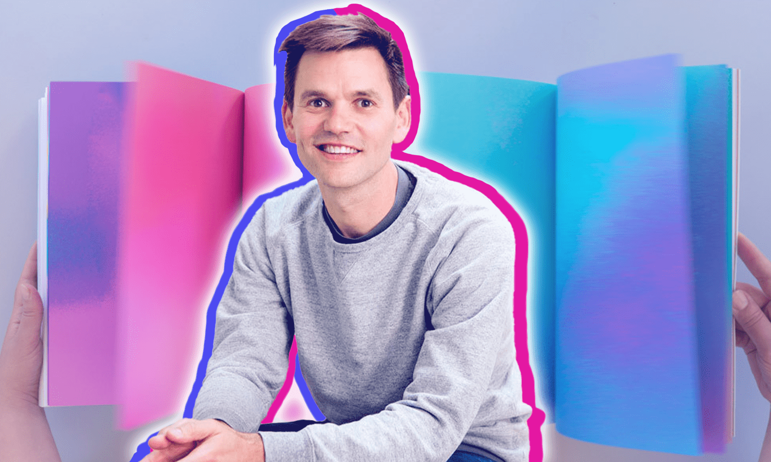
Martin Grasser

“Sorry I’m late,” said Martin Grasser the first time we met over Zoom. “I’m drawing a baseball player.” I expected to see barely-there pencil marks forming the base of what might eventually look like a batter in motion. Instead, Martin picked up his iPad to reveal what can only be described as a photograph of a headless San Francisco Giants player. The depth, color, shadow, and movement he’d created in just 15 minutes blew my mind. This made me even more excited to talk art with him.

From his Bay Area studio, Martin produces work in an iterative mode, isolating core concepts and expanding upon them through repetition (check out his website and it will all make sense). In 2016, he joined forces with strategic partner Gabrielle Muse to launch Studio Mococo, where he leads a diverse creative team producing brands that celebrate art in the everyday.

You probably don’t know it, but you see Martin’s work all the time. (For those of us who communicate in 280 characters or less, that’s literally every day.) I chatted with Martin about the importance of participation in experiential, creative as capital, and a very special little blue bird celebrating its 10th birthday this year.

Samantha Stallard: How do you balance Studio Mococo’s projects with your personal art?

Martin Grasser: I went to art school rather late — at age 29 — because I had a baby. So I needed a way to make money. I was into typography, and branding became a natural extension of that work. I got really into conceptual art and learning about new ways of making art beyond drawing and painting.

Of course, no one had yet conceived of NFTs or anything like that; you were either hired by a gallery, which took 50 or 60%, or you were creating a new market for yourself. I’ve always had this corporate design practice going, but in the background, in the nights and weekends and margins of my life, I’ve been making art.

I like to take my time with art projects, so it’s good that I don’t have to make all my money on my art. It’s been a great privilege for me to protect it and keep it in place where I want it, because I don’t have that luxury with design. I like the challenge of making something for myself in the art world and then being part of a nine-person team to make a logo. No one wants to work completely in solitude, but I don’t want everything I do to go through a marketing department.

SS: Is there pure art and then brand art?

MG: Corporate graphic design influences the type-design studio. Then the type-design studio influences the fine art practice. And then fine art influences the images we make, and around and around it goes. I approached school knowing that I want to do both of these and that the ideas can bounce back and forth between them.

SS: It’s the 10th anniversary of the Twitter logo, which you designed. When you look back on it now, how do you feel about that little blue bird? Would you do anything differently?

MG: No. I always say, with all humility, it’s a great drawing of a bird. It feels like a piece of typography. As one of my professors said, “Typography is little pieces of architecture.” And so that’s the way you modulate weight and a curve, the way you create proportion and white space, positive and negative relationships and everything.

The bird has to exist at both 16 pixels and on the side of a building. The form is super beautiful and a classic mark that will stand the test of time. Twitter really is a democratic platform; it democratizes news, so how do you create something neutral that can sit next to such a range of information? The neutrality is in the simplicity of the circle. I’m excited that it’s lasted this long.

SS: When you see the logo today, do you still feel an emotional connection?

MG:​​ There’s a slow separation from feeling attached to corporate work that way, because that was for Twitter. I’m still really proud of it, though. Every graphic designer loves being part of the zeitgeist. My professors would say, “I did the Jaws poster” or “I worked on Indiana Jones.” Typography is a reflection of the times. We can see an ad from 1986 and absolutely know when it’s from. Participating in culture that way is really cool.

I feel so lucky to have been in the right place at the right time. My mom travels a lot, and she’ll be in India or Japan or Russia and send me a picture of the little bird. It’s kind of cool that it’s over there across the world.

SS: Speaking directly to artists, what advice do you have for them trying to create brand partnerships?

MG: When you’re building corporate communications, which is what I see marketing departments doing, it’s hard for companies to see the value in art. Try to find people who can appreciate the role of creativity. There’s a designer named Mike Monteiro who wrote Design is a Job, which is filled with little nuggets about being in corporate workspaces as a designer.

Really make sure the company is ready for your work. Sometimes in my career when I’ve shown people art, it’s caused more confusion. For instance, I made a typeface out of colored circles called Color Dot. I used to have a website that showed both my corporate work and my artwork, thinking it would make me appear more interesting and multidisciplinary. But when I tried to combine these worlds, people were like, “Are you going to take my money and make an abstract font?”

I’d say separate your work and be very clear about the differentiation in your offering. Right now especially, we’re seeing a proliferation of designers who are finally feeling that there’s a place for them in the art world. Again, this is just my experience. With the explosion of digital art, there are multitudes of ways for artists to engage with collectors with less gatekeeping. Creative is capital. That’s your thing as a creative person, so find a way to charge for it.

Be very clear about where you fit in and what your role is. “I make art for conferences. I make interactive art. I make art with music and light shows.” Studio Mococo is clearly a corporate branding agency, martingrasser.com is clearly art, and andrepeat.com houses art experiments and typography.

SS: How should artists charge brands?

MG: Think about brands as a National Endowment for the Arts circa 2022. An artist should never offer a cheap rate for a brand or spec work. You’re charging on behalf of the industry so that everybody gets to make something. Be aggressive about your worth. I hire a lot of junior designers, and I was the same way when I came out of school. “I don’t know if this is all right, but I would like to charge…” It’s far too apologetic.

Go in there with the confidence and the assurance that you’re worth it. It’s hard to hire good designers, so when somebody can clearly articulate a corporate communication, that’s invaluable to a company. Every single time you talk to somebody, add 10% and be willing to come down.

When I was freelancing, first I charged $50 an hour. Then, for the next client I charged $60 an hour. Then $70. Then $85. And if they said, “We can’t swing that,” I’d say, “Let me make some phone calls and see if I can do it for 75.” And then I would wait a day and go back to them with, “Hey, I’m really excited about your project, so I’m going to come down and do it for 75. Moving forward I’d love for you guys to budget me at 80. But this time, I was able to push off this other project.”

SS: What was the last truly magical experience you had?

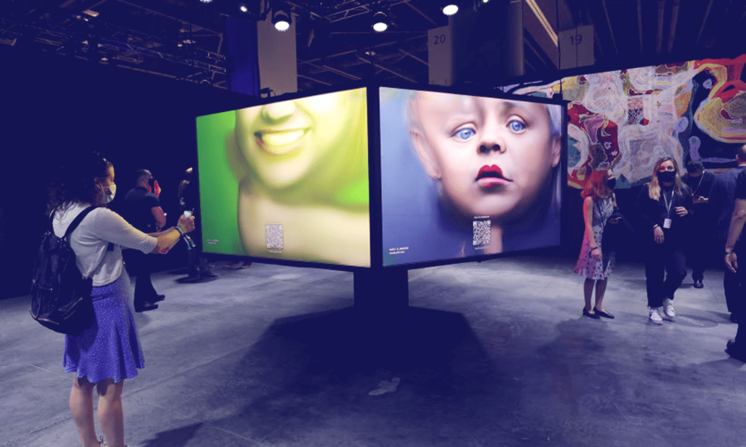
MG: Right before the pandemic, I went to the SFMOMA with my two youngest kids. There was an interactive display where we looked up at this opaque panel and a camera took sequence photos. Basically, it was a really artistic, interactive photo booth. We’d looked at seven floors of art, which was more of a one-way conversation — standing in front of art and learning why it was important. I love museums, but there was something about participating in the art that meant more to me.

Those photos are some of my favorite pictures of my son and my daughter together. MOMA presented this very elevated, fancy space with something that my kids were encouraged to touch and participate in. It’s really cool to be part of the making of something.

People will say, “Oh, I’m not creative. I can’t draw.” What do those two things even have to do with each other? What if schools had more creativity? Instead of writing a paper, make a film, do a dance. It doesn’t just have to be read and then written. What if there were other ways to think about the role of creativity in answering a question or crafting the equivalent of a term paper? I communicate through color and shape and form; that’s what the Twitter logo is.

So you can go to an expert level if you want, but you can also just experiment and be able to say, “Look at that. I made that.”

Join us in XP Land. A community for experiential creatives and experience-makers, brand leaders and IP-owners, space stewards and venue visionaries — all of those in the business of epic gatherings and live, immersive storytelling.

Join our Community
or
REGISTER WITH XP LAND

Password and Confirmation do not match

By continuing, you agree to the Terms of Service and Privacy Policy.

Thank you! Welcome to XP Land.

A verification email has been sent to . Please verify your email to continue, and you’ll receive our weekly e-newsletter, full access to our content, and more to come.

Forgot your password?

Enter your email, and we’ll send reset instructions.

Check your inbox

We’ve sent a password reset link to . If you don’t see it in your inbox, check your spam or junk folder.

Reset Your Password